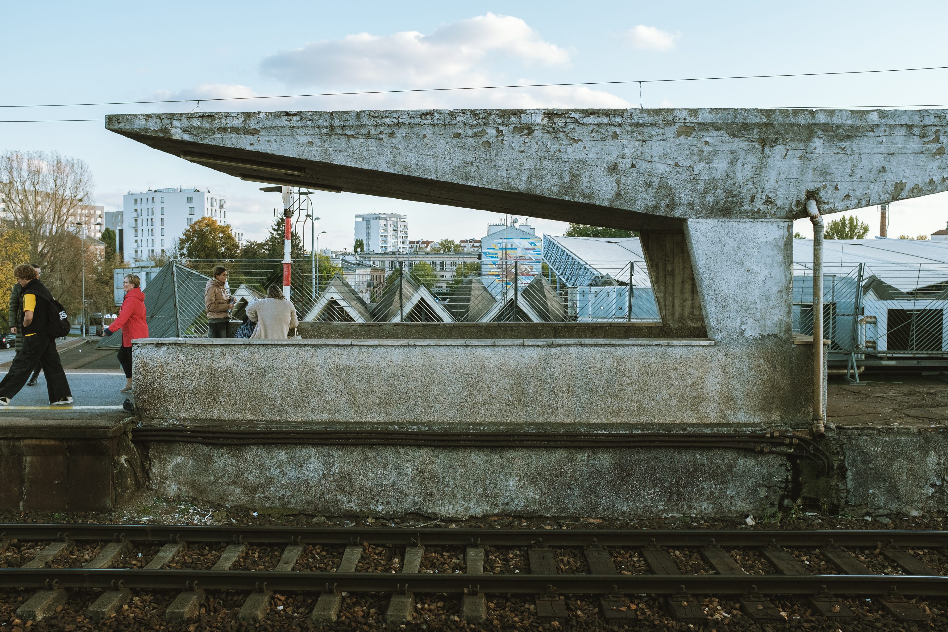
Brutalism was an architectural trend in the 1950s, where raw materials were in the spotlight and the function (sometimes) ruled over the form. Not to mention it was born out of a time of necessity.
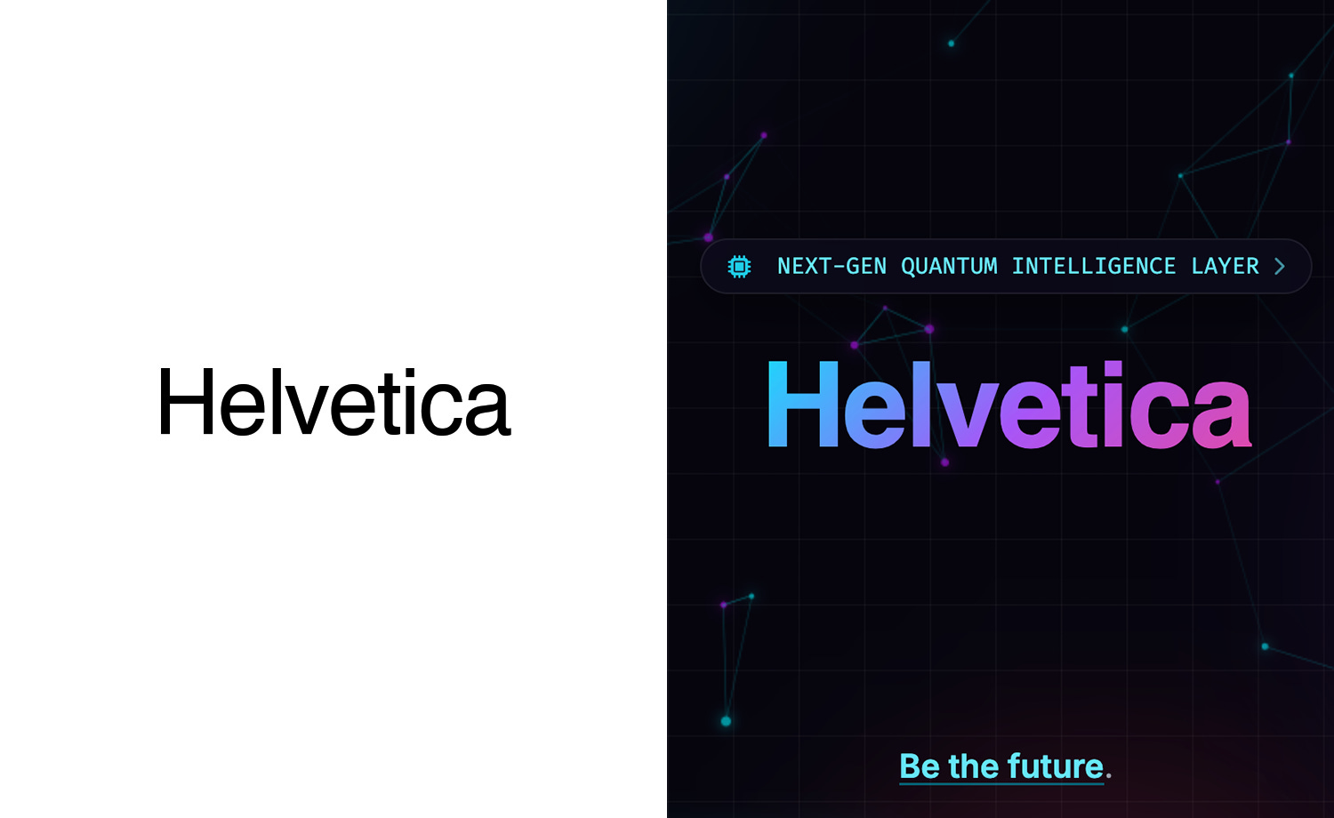
When I say brutalism in this article, I am referring to a graphic design style born out of the structure of the machine. Either HTML code for web or basic styling in a graphic program. These are two widely different times and trends. We all see a website or poster with giant Helvetica and call it brutalism. This is wrong, but we all get the idea and understand.
There are many current spin offs of this web-era of design in relation to brutalism. Neubrutalism is a common topic in this discussion. I mention Neubrutalism, but that is not the style I am aiming to describe here. Neubrutalism can still try too hard to be cute, fun, playful, or just have too much stuff in general.
As we have seen for a few years now, many of the SAAS, e-commerce, or just AI service providers in general all seem to have the same look. “AI Slop” or “Vibe-Coded” are terms tossed around. AI is great at generals. Data or design, whatever is, AI will generalize and provide a general approach. Why give a contrasting or brash answer to a simple question. A good designer knows when to go all in and when to hold back.
All that to say, these AI designs, specifically websites, all look average. Generally in aesthetics. A button may have a drop shadow, glow, border, hovering animation, you name it. That’s a little too much for me.
The pendulum of design is making its amplitude in relation to AI design. I am predicting more and more websites will be pushing to no glare, no shine, no dazzle, strictly information as a design. This applies to graphics and videos as well. Overproduced work now signals AI input, aid, or completely AI.
Take for example a portfolio. This might be a hot take, but I personally don’t enjoy viewing a portfolio website that has a bunch of “dynamic content” or effects. Please don’t take control of my scroll wheel. Just show me the work already!
When updating the New Head Design website, I took inspiration from old instruction manuals. This isn’t brutalism by any means, but many of the layouts aim to be as straight forward as possible. I like art though, so some parts have a touch of dazzle.
I’m not sure what to call this style of design I am suggesting. Info-brutalism. Info-minimalism. Only time will tell. Side note, who gets to name design trends? I’d like to either name a fish or a design trend someday.
What do you think? Do you also feel overwhelmed by over-designed websites, posters, branding that may or may not be a by product of AI? How about a push from the dazzle to the straight to the point information.
I personally am finding myself implementing this in my everyday life. I now write my pitches in a word doc and just email it to someone. Or just screen record myself talking. No crazy demos or sizzles to hide behind.